Monday, October 16, 2017

Autumn Blessings

Hi, Lois here with an autumn card today.  Yesterday one of the challenges on Splitcoaststampers was entitled "Textures of Fall."  I was inspired by that challenge to make my CottageCutz card for today.  It combines all kinds of textures and texture techniques -- embossing, layering, sponging.


I started my card with the Pine Cone Branch die. Originally, I was going to cut it from white cardstock and color the various elements; but I decided that I wanted a bit more "texture."  So I cut it from both green and tan cardstock.  I thought that building up the pine sprigs (the green onto the tan) would give some more depth to them.


I then sponged Ranger Pine Needle ink onto the green die-cut and Vintage Photo ink on the tan one.


Then I cut the pine sprigs off the green die cut and glued them to the tan one . . .


. . . and added the additional pinecones and pine sprigs.


Once the tedious part was complete, I cut my cardstock.  

Dark Gold - 5 1/2" x 8 1/2", scored at 4 1/4"
Cream - 4" x 5 1/4"
Scrap of Dark Gold large enough for the focal panel


I have a Darice embossing folder of fall foliage.  I took some Ranger Distress ink (Dried Marigold, Fired Brick, Rusty Hinge, Vintage Photo) and rubbed various parts of the embossing folder.


When I embossed the cream cardstock, the ink gave the embossing some nice fall coloring, and then I cut the focal panel with the largest Rounded Rectangle die.


I constructed my card base, using Scor-Tape to hold down the embossed panel and large foam pop dots to add the rectangle.  I had stamped the word "Autumn" in the Pine Needle ink at the lower right-hand corner of the dark gold panel and die-cut the word "blessings" using one of the Expressions Plus dies.


I then added my constructed pine bough, and my card was finished.


CottageCutz dies used on this card are:

http://www.scrappingcottage.com/cottagecutzpineconebranch4x6.aspx

http://www.scrappingcottage.com/cottagecutzroundedrectanglesetbasics.aspx

http://www.scrappingcottage.com/cottagecutzexpressionsplusblessingsphrase.aspx


Don't forget that CottageCutz has lots of new Halloween and Christmas dies on their website.  Be sure to check them out!


Sunday, October 15, 2017

Cards with Birds

Hi!

It's Anja here. Last week I told you I prefer to use dies over stamps on my cards. But this week I decided to use stamps. Cottage Cutz has a few new stamp and die sets with beautiful birds and flowers motives. I colored two of my favourite and used them on cards. This is how the finished cards look like.


To make the cards I used:
- Cottage Cutz dies (Sparrow on Post, Bluejay & Apple Blossom, Spring Greenery, Nested Stitched Scallop Oval Set, Sweet Spring Kitty),
- Distress Inks (Peeled Paint, Forest Moss),
- Distress Oxides (Peeled Paint, Twisted Citron, Lucky Clover, Faded Jeans, Fired Brick, Broken China, Vintage Photo),
- two craft card bases (10,5x15 cm),
- water color paper for stamping,
- white card stock for die cuts,
- Versafine Black Onyx ink,
- Derwent watercolor and inktense pencils,
- Zig watercolor pencils,
- stamp with lettering motive,
- glossy accents,
- red, black, white, yellow pen,
- stamping platform,
- washi tape.

First I stamped the image on watercolor paper.


I colored both images with the combination of Zig markers and watercolor pencils, because I only have a few Zig markers. I mostly color with Derwent color pencils. They are my favourite.


When I finished coloring I cut the motive with my Big Shot machine. I used washi tape to fix the die.


I used the same coloring technique for the other bird image.


Then I die cut the ovals and colored them in light blue inside the die.


For the background I stamped directly on to the card base. Oxides really leave a clear image on craft background. I used Vintage Photo around the edges.


Then I die cut some greenery and flowers, colored them with combination of Distress Inks and Oxides and glued everything on the card base.


And for the finish touch I used some Glossy Accents.


I hope you will give this beautiful birds a try. They are so much fun to color. 

Have a beautiful and sunny Sunday and I will be back next week. 

Anja Z. 


Cottage Cutz dies I used:


Saturday, October 14, 2017

Snowflakes + Mother of Pearl Technique

Hello Scrapping Cottage friends! Thanks for taking the time to stop and visit today. It's Mary Marsh here bringing you the Saturday edition of the Blog.

Just as a reminder, CottageCutz has a new release of Halloween & Christmas dies that are now available in the online store for ordering. The DT has been showing lots of great samples and will continue to show them over the next couple of months to get your creativity flowing. There are plenty of beautiful new Christmas dies and we have something for everyone's tastes.

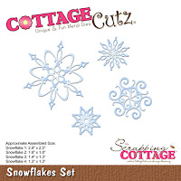
Today, I used a new Christmas die, Snowflakes Set for my sample card. I chose the faux mother of pearl technique for my background because it's a very simple technique to do and it has a huge impact on your finished card.  I also thought it would give the illusion of a snow squall. So perfect for my snowflake images.  Here is a video link to a tutorial on Splitcoaststampers.

And, I also wanted to show a card that would be easy to mass produce using this new die. So let's get started with some details on how I created my card.

Step 1: I used some Frost White Acrylic paint from Tsunineko. It has a bit of a shimmer to it. This paint acts as a resist and shows through the colors that I will sponge on in the next step.

I put a small amount of the frost paint on my craft mat. I used a piece of cling wrap and scrunched it up and then dipped it in my frost paint. I pounced it on my craft mat to work it into my cling wrap and also to insure that I didn't have any big globs of paint.
I then dabbed it lightly on my white cardstock. I left some open space so I could sponge the colors I was going to use. There is lots of shimmer on this panel that is hard to capture in a photo. I set it aside at this point to allow it to dry.

Step 3: Once the paint was dry, I decided on the shades of distress ink with tumbled glass and broken china.
 Once I started to sponge the ink on I added a 3rd shade of ink using peacock feathers. I liked the color variation that I achieved. You can see on the photo below the white paint has resisted the distress ink. When I finished sponging I used a paper towel to rub off the ink that was sitting on top of the white frost paint. This allows more of the frost design underneath to come through.
Step 4: Since I was going with a turquoise card base, I decided to layer the pearl panel on white. Just for some variation between layers.
Turquoise Card Base: 5 1/2" x 4 1/4"
White Layering Panel: 5 1/4" x 4 1/8"
Background Panel Size: 3 7/8" x 5 1/8"
Step 5: I cut my snowflake images from white cardstock. They are such pretty shapes and I really like the size variation.  I was able to use all 4 of the images on my background panel.
To adhere the snowflakes to the background panel, I cut small pieces of dimensional adhesive. I didn't want them laying flat against the background.
Step 6: The sentiment is from an older CottageCutz die - Merry Christmas Santa. I cut it from one of my practice panels that I made. I sponged more ink on it for more of a contrast. I also cut another phrase in white and very slightly offset it.  
To complete my card I attached it to the turquoise base. I wanted some depth between these two panels so I used some white fun foam behind the image panel. It gave it just the lift I was looking for I secured it with Tombow liquid multi glue.
 
I hope I have given you some inspiration for your Christmas cards. I am going to make a few more of this particular one. Well, that's it for me for this post. See you next Saturday.
 
Dies I used to create card:
http://www.scrappingcottage.com/cottagecutzsnowflakesset.aspx

http://www.scrappingcottage.com/cottagecutzmerrychristmassanta.aspx


Friday, October 13, 2017

Believe in the Miracle

Happy Friday!  It's Jeanne sharing today and I have a card that is simple yet elegant. As I was making the card I was asking myself if it needed "something more" but when I was finished I was very happy with the result.
I have a shelf across the room from my desk where I place my cards and this one really "shines".  The card base is 10 x 5 inches, scored at the 5 inch mark to make a 5 x 5 inch card.  I used black card stock and die cut the manger scene.
I used the outside of the die cut as a pattern and masked off a rectangle slightly smaller than the die cut.  I also masked off a rough star shape in underneath where the star on the die is.  I used Broken China, Salty Ocean, Faded Jeans and Wilted Violet Distress Oxide inks and a blending tool to create a night sky.  I kept the lightest color nearest the star.  The Wilted Violet is only in the corners.
I then covered the background with paper and added some splatters of the Broken China and Salty Ocean to add some interest to the white portion of the card.
The I used silver embossing powder to heat emboss my sentiment.
I adhered the die cut on top and added a rhinestone to the center of the star and a few near the sentiment.

I hope you enjoyed this simple card today.  Although it goes together quickly, it does have an impact.  The Oxide inks seem to glow behind the silhouette die cut.

Have a great weekend!
http://www.scrappingcottage.com/cottagecutzbabyjesuswithanimalselites.aspx